Community Health Factors Data Module Help
WISQARS™ Community Health Factors module helps describe the role of social determinants of health on fatal injuries. Social determinants of health are conditions in the places where people live, learn, work, and play that affect a wide range of health risks and outcomes. Research and data show that fatal injuries disproportionately affect many populations. Examining the social and environmental factors that surround communities helps describe a more comprehensive picture of the root causes of injuries. These can be used to better inform injury prevention efforts.
The data sources for the Community Health Factors module are.
- Fatal injury data from the National Center for Health Statistics-CDC annual mortality data files.
- Population Estimates from the U.S. Census Bureau.
- Social Vulnerability Index (SVI) data calculated by CDC/ATSDR using U.S. Census Bureau data.
- County Health Rankings and Roadmaps data calculated by the University of Wisconsin Population Health Institute.
Getting Started
To customize the map displayed when you access the module, you will begin by clicking the "Change Filters" button near the top, right of the screen.
WISQARS™ Data Use Agreement
You are asked to agree to the terms of the WISQARS™ Data Use Agreement the first time you click on the "Change Filters" button. Click "I Agree" on the pop-up screen to accept the confidentiality terms for data usage and to continue to the "Data Filters" screen.
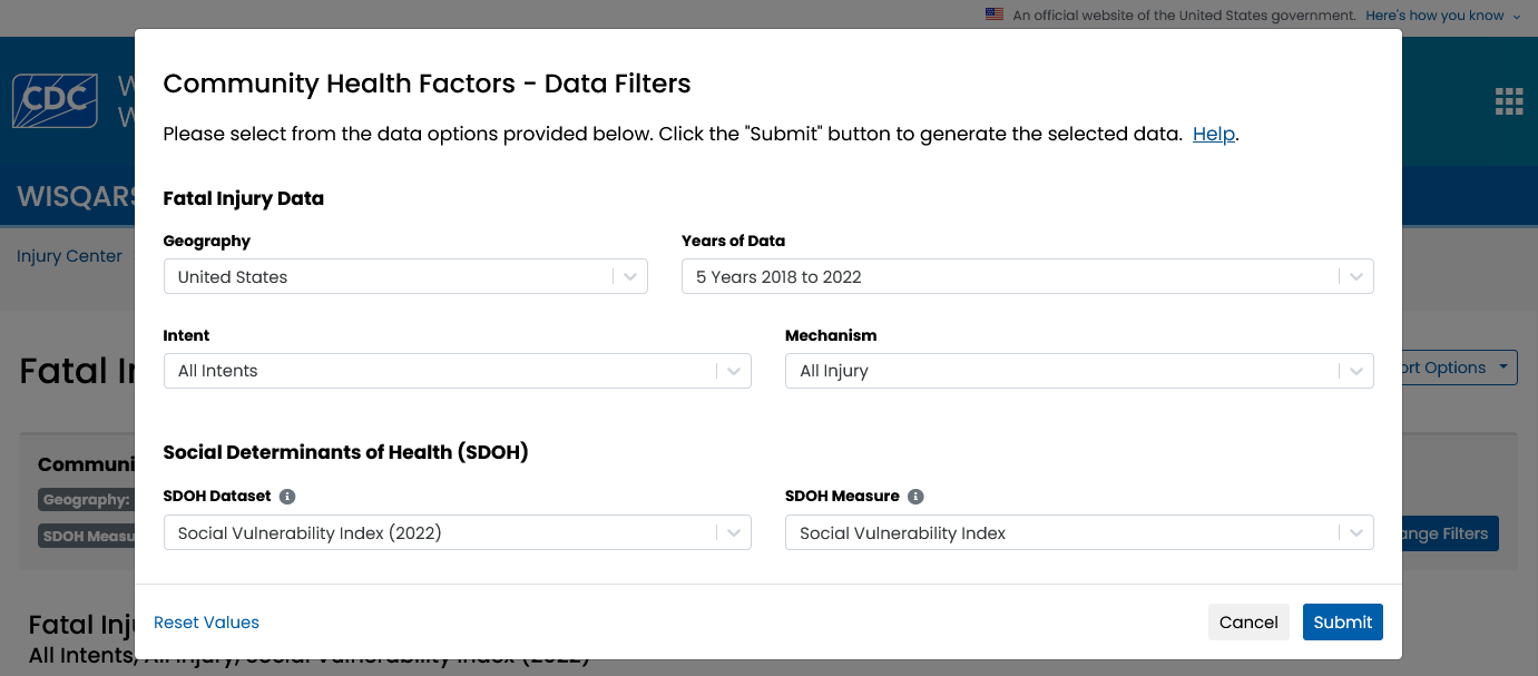
The Data Filters screen will allow you to make some key decisions about the data you want to view—such as years, geographic level, intent and mechanism, and social determinants of health—to create a map.

Fatal Injury Data
Data Filters: Geography
From the dropdown menu under "geography", users can select United States to see a U.S map showing rates for fatal injuries and SDOH measure values at the county-level for all States. Users can also request to see the same data for only one State.
Data Filters: Years of Data
Users can select the number of years they want to explore from the dropdown menu under "Years of Data." Users can either select 5-years to see the most recent 5 years of data or 10-years to see the most recent 10 years of data. The default selection is the most recent 5 years of data.
Data Filters: Intent
From the drop-down menu under "intent" users can select which injury intent to display in the map. Intent of injury is whether an injury was caused by an act carried out on purpose by oneself or by another person(s), with the goal of injuring or killing.
The intent categories for injury-related deaths are:
- All Intents
- Unintentional
- Violence related (homicide, legal intervention, suicide)
- Undetermined
WISQARS Glossary
Find definitions for the different injury intents at the WISQARS Glossary.
Data Filters: Mechanism
From the drop-down menu under "mechanism" users can select which injury mechanism to display in the map. The mechanism, or cause, of injury is the way in which the person sustained the injury; how the person was injured; or the process by which the injury occurred.
There are 28 mechanism categories for injury-related deaths. Of those, adverse effects overall, fire/burn, poisoning, transport-related overall, motor vehicle - traffic, pedal cyclist, and pedestrian mechanisms have options that allow the user to run more detailed queries.
Social Determinants of Health
Data Filters: SDOH Dataset
From the drop-down menu under "SDOH Dataset" users can select to see social determinants of health from the Social Vulnerability Index (SVI) 2022 dataset, or from the County Health Rankings & Roadmaps 2023 dataset.
The CDC/ATDSR Social Vulnerability Index (SVI) is calculated using U.S. Census Bureau variables to rank county-level social vulnerability and is currently updated every two years.
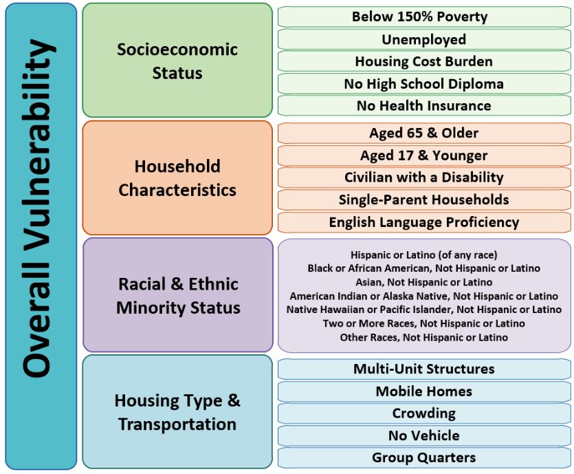
Social vulnerability refers to the potential negative effects on communities caused by external stresses on human health. In addition to calculating an overall vulnerability score, CDC/ATSDR estimates four social vulnerability themes:
- Socioeconomic Status (below 150% poverty, unemployed, housing cost burden, no high school diploma, and no health insurance)
- Household Characteristics (age 65 or older, age 17 or younger, civilian with disability, single-parent household, English-language proficiency)
- Racial and ethnic minority status
- Housing type and transportation (multi-unit structures, mobile homes, crowding, no vehicle, group quarters)

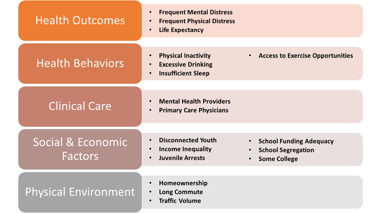
The County Health Rankings and Roadmaps is a program that provides data, evidence-based solutions, and guidance to improve community health across the United States. It’s a collaboration between the Robert Wood Johnson Foundation and the University of Wisconsin Population Health Institute. It includes over 90 measures across various categories to assess and rank the health of U.S. counties. These measures are divided into two broad categories: health outcomes (length of life, quality of life), and health factors (health behaviors, clinical care, social and economic factors, and physical environment).
With the Community Health Factors Data Module, you can find how 18 of these measures affect injury rates.

Data Filters: SDOH Measure
Social determinants of health (SDOH) are conditions in the places where people live, learn, work, and play that affect a wide range of health risks and outcomes.
From the drop-down menu under "SDOH Measure," users can request to see county-level social determinants of health data they are interested in.
Users have the option to select specific measures within the Social Vulnerability Index (SVI) 2022 dataset, or within the County Health Rankings & Roadmaps 2023 dataset depending on the database selected under "SDOH Dataset."
County Health Rankings and Roadmaps 2023 Dataset – Selected Variables
Visit County Health Rankings and Roadmaps for more information about these data.
Below are definitions and examples of how to interpret each variable when a county is in the lowest quartile of vulnerability risk.
Health Outcomes
Frequent Mental Distress is the percentage of adults reporting 14 or more days of poor mental health per month (age-adjusted).
Counties in the lowest quartiles represent counties with the lowest percentage of adults reporting frequent mental distress.
Frequent Physical Distress is the percentage of adults reporting 14 or more days of poor physical health per month (age-adjusted).
Counties in the lowest quartiles represent counties with the lowest percentage of adults reporting 14 or more days of poor physical health per month.
Life Expectancy is the average number of years a person can expect to live.
Counties in the lowest quartiles represent counties with the greatest average number of years a person can expect to live.
Health Behaviors
Access to Exercise Opportunities is the percentage of population with the adequate access to locations for physical activity.
Counties in the lowest quartiles represent counties with the greatest percentage of population with the adequate access to locations for physical activity.
Excessive Drinking is the percentage of adults reporting binge or heavy drinking (age-adjusted).
Counties in the lowest quartiles represent counties with the lowest percentage of adults reporting binge or heavy drinking.
Insufficient Sleep is the percentage of adults who report fewer than 7 hours of sleep on average (age-adjusted).
Counties in the lowest quartiles represent counties with the lowest percentage of adults who report fewer than 7 hours of sleep on average.
Physical Inactivity is the percentage of adults ages 18 and over reporting no leisure-time physical activity in the past month (age-adjusted).
Counties in the lowest quartiles represent counties with the lowest percentage of adults ages 18 and over reporting no leisure-time physical activity in the past month.
Clinical Care
Mental Health Providers is the ratio of population to mental health providers.
Counties in the lowest quartiles represent counties with the smallest ratio of population to mental health providers.
Primary Care Physicians is the ratio of population to primary care physicians.
Counties in the lowest quartiles represent counties with the smallest ratio of population to primary care physicians.
Social & Economic Factors
Disconnected Youth is the percentage of teens and young adults ages 16-19 who are neither working nor in school.
Counties in the lowest quartiles represent counties with the smallest percentage of teens and young adults not working or in school.
Income Inequality is the ratio of household income at the 80th percentile to income at the 20th percentile.
Counties in the lowest quartiles represent counties with the smallest ratio of household income at the 80th percentile to income at the 20th percentile.
Juvenile Arrests is the rate of delinquency cases per 1,000 juveniles.
Counties in the lowest quartiles represent counties with the smallest rate of juvenile arrests.
School Funding Adequacy is the average gap in dollars between actual and required spending per pupil among public school districts. Required spending is an estimate of dollars needed to achieve U.S. average test scores in each district.
Counties in the lowest quartiles represent counties with the smallest average gap in dollars between actual and required spending per pupil among public school districts.
School Segregation is the extent to which students within different race and ethnicity groups are unevenly distributed across schools when compared with the racial and ethnic composition of the local population. The index ranges from 0 to 1 with lower values representing a school composition that approximates race and ethnicity distributions in the student populations within the county, and higher values representing more segregation.
Counties in the lowest quartiles represent counties with the lowest amount of segregation.
Some College is the percentage of adults ages 25-44 with some post-secondary education.
Counties in the lowest quartiles represent counties with the greatest percentage of adults ages 25-44 with some post-secondary education.
Physical Environment
Homeownership is the percentage of owner-occupied housing units.
Counties in the lowest quartiles represent counties with the greatest percentage of owner-occupied housing units.
Long Commute is the percentage that commute more than 30 minutes among workers who commute in their car alone.
Counties in the lowest quartiles represent counties with the lowest percentage of individuals that commute more than 30 minutes among workers who commute in their car alone.
Traffic Volume is the average traffic volume per meter of major roadways in the county.
Counties in the lowest quartiles represent counties with the lowest average traffic volume per meter of major roadways.
From the data filters screen, users should click "Submit" to generate the data they want displayed. The data are generated as a map by default.
The gray boxes above the map – called "breadcrumbs"— display the data selections made in the Data Filters screen.
Two numbers are displayed beneath the "breadcrumbs" that represent the number of injury deaths and total population in the selected data filters.
The county lines have been drawn on the map. A pop-up box will show the following data for that county when you hover your cursor over any county.
- Social determinant of health (SDOH) measure value
- Social determinant of health (SDOH) measure quartile
- Age-adjusted mortality rate
- Age-adjusted mortality quartile
Age-adjusted Mortality Rate Quartiles
County-level age-adjusted fatal injury rates are per 100,000 population and are ranked by quartile (low, mid-low, mid-high and high).
SDOH Measure Quartiles
Social Vulnerability Index (SVI) percentile ranking values are ranked from 0 to 1 in quartiles as
- Low (0.0-0.2500)
- Mid-low (0.2501-0.5000)
- Mid-high (0.5001-0.7500)
- High (0.7501-1.0)
Higher SVI ranking values correspond to higher vulnerability.
County Health Rankings and Roadmaps quartiles are based on the values of indicators selected from the dataset. The quartile distribution will vary based on the composition of the variable and what is identifying. For all quartiles, the low represents counties whose data fall in the lowest 25%, while the high represents counties whose data fall in the highest 25%
The SVI or CHRR ranking for a county will differ depending on whether national or state-specific data are selected. For state-specific data, counties are ranked relative to other counties in the state. For national-level data, counties are ranked relative to all counties in the United States (including the District of Columbia).
Counties are colored according to their age-adjusted fatal injury death rate and vulnerability value. There is a legend to describe the map data to the bottom-right of the map. Users can change the color theme (i.e., blue, purple, or blue-red) from the menu at the bottom of the chart.
From the menu at the bottom of the chart users can choose to display data as a map (the default view) or table.
Users can sort the data by county, SDOH measure, or age adjusted mortality when they choose to display data as a table or view data in ascending or descending order.
- Click the selection box under "Sort" and select county, SDOH measure, or age adjusted mortality to select how you would like to sort the data.
- Click the selection box under "Order" and select ascending or descending.
Click "Apply Options" to generate the data with your selections.
